Designing an interactive database of 400+ nonviolent movements for CANVAS.
Client: CANVAS (Centre for Applied Nonviolent Action and Strategies) — a Belgrade-based non-profit founded in 2005 to promote nonviolent resistance in support of human rights and democracy. Since its founding, CANVAS has worked with pro-democracy activists from more than 50 countries, operating through offices in Belgrade, Washington DC, Manila, Tbilisi, and Johannesburg.
Role:
UX/UI Designer — end-to-end, from discovery to handoff.
Collaboration:
2 UX/UI designers, PM, development team
The vision
An interactive world map where researchers, journalists, activists, and curious users could browse all cases geographically, filter by what matters to them, and read in-depth about each movement on its own dedicated page.
Two core problems shaped the entire design process:
Information overload
Each protest entry carried a large number of attributes, and the client wanted to expose all of them as filters.
Visual density on the map
With 400+ data points worldwide, zooming out risked turning the map into an unreadable cluster of overlapping pins.
Stakeholder alignment
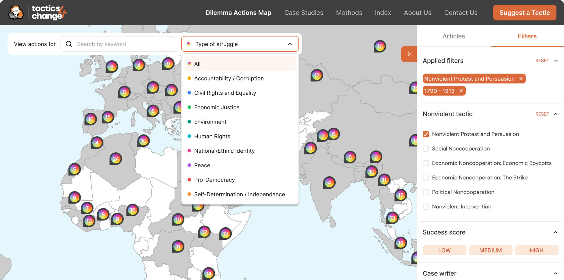
The project kicked off with the client sharing a large Google Spreadsheet. Every protest entry had dozens of attributes, and the ask was straightforward: put all of this on the map.
We knew that wasn't the right solution — a map with 17+ active filters wouldn't be a research tool, it would be a frustration machine. We pushed back, but the clients were unconvinced. So we stopped arguing and started showing.
We built a prototype that did exactly what they asked — all filters, fully exposed. We put it in front of them. Seeing it rendered made the problem tangible in a way no explanation could. The clients agreed to prioritize.
We studied similar map-heavy products — Google Maps for clustering conventions, Figma's multiplayer interface for pin visual language — and used those references to ground the conversation with both stakeholders and developers in something concrete.
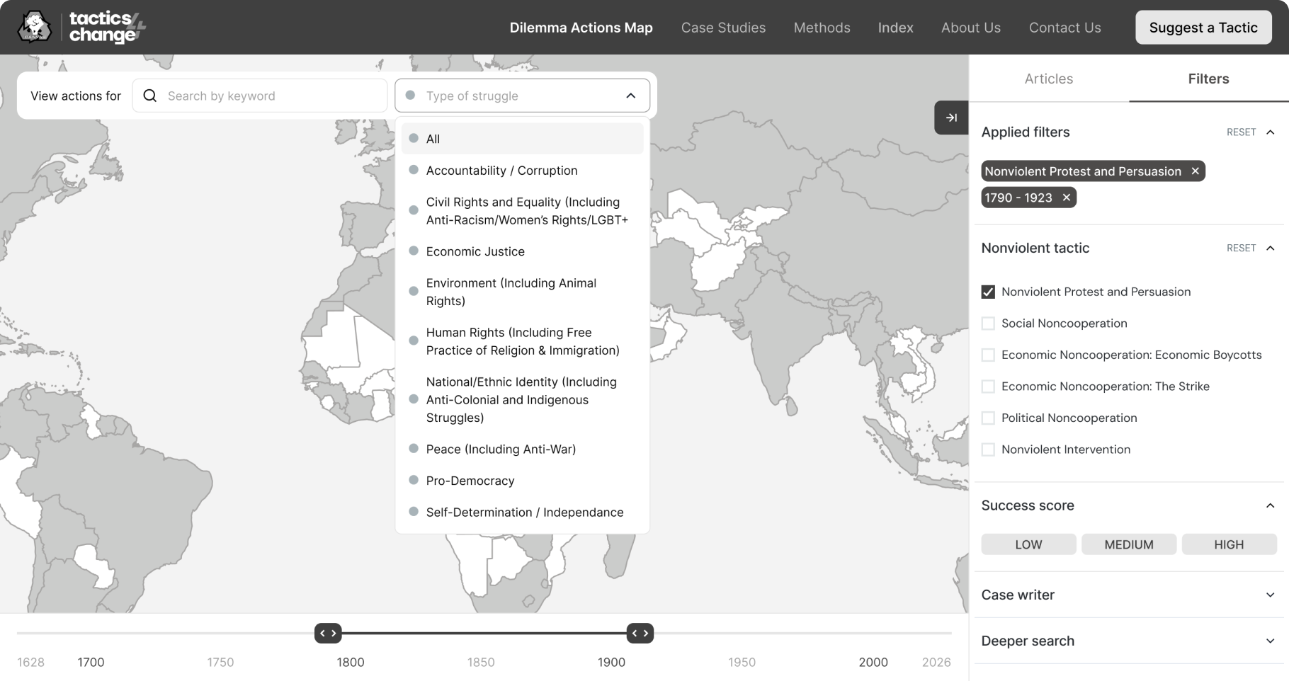
Together, we narrowed the filters down to six:
Filter
Rationale
Country
Primary geographic orientation — how most users would start
Year
Enables temporal analysis — trends over decades
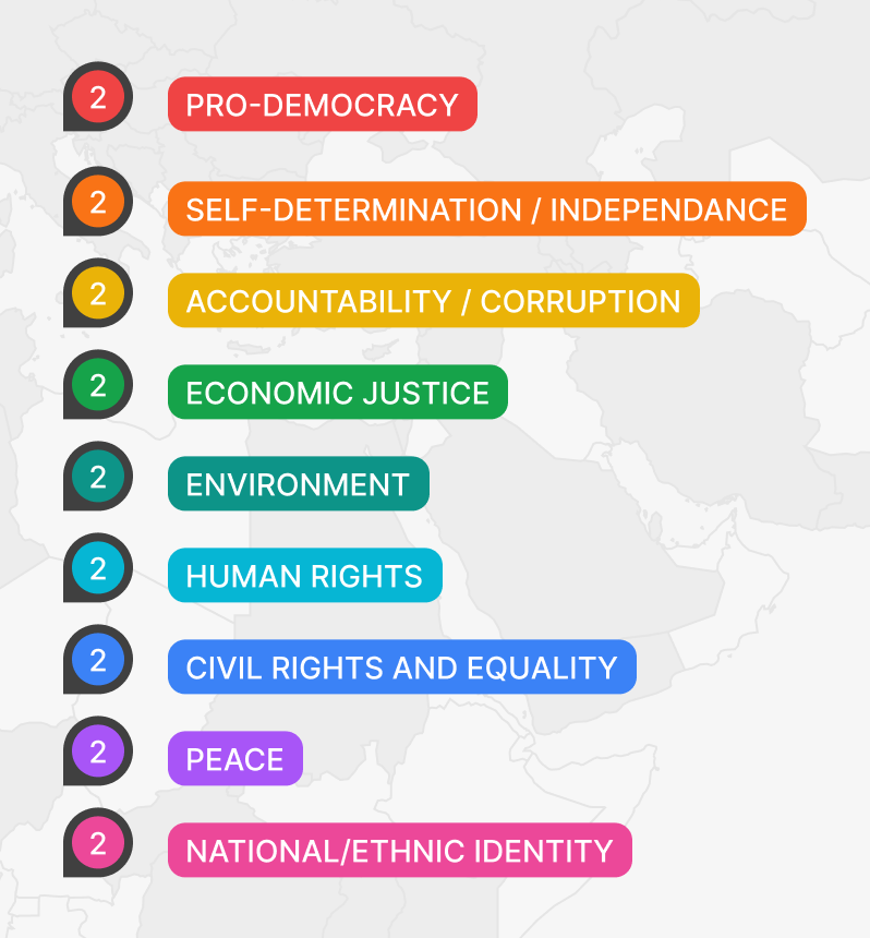
Type of protest
The 9 core categories, each with its own color on the map
Tactics used
Based on the 198 Methods of Nonviolent Action, grouped into clusters
Success score
Simple Low / Medium / High — immediately meaningful
Case writer
Surfaces credibility and lets users follow specific researchers
We decided to keep 12 additional filters — things like “Concessions were made”, “Media coverage was sympathetic to activists”, “Dilemma action reduced fear and/or apathy” — under the “Deeper search” filter. They are still accessible but do not create visual noise.
Wireframes & key design decisions
The layout was clear from the start
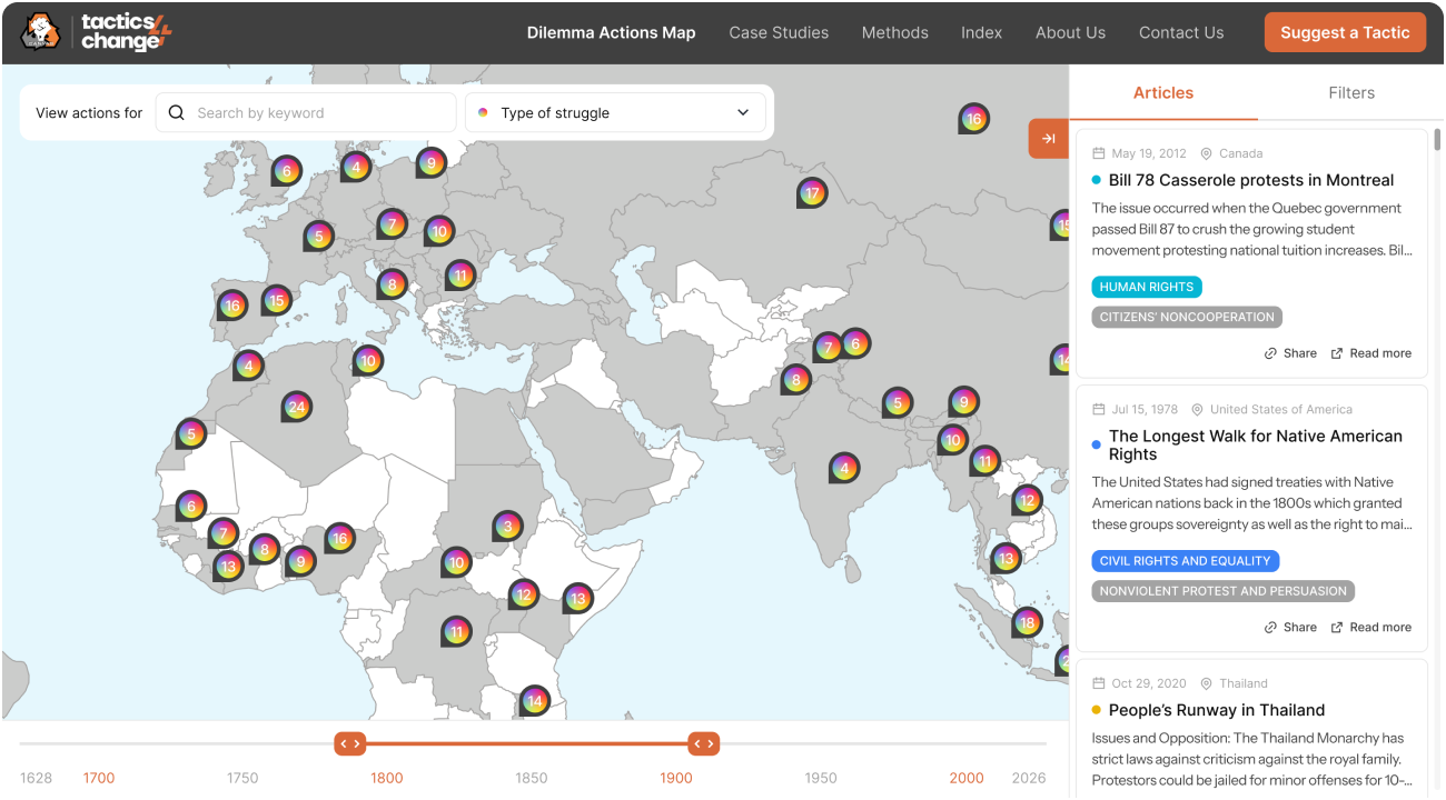
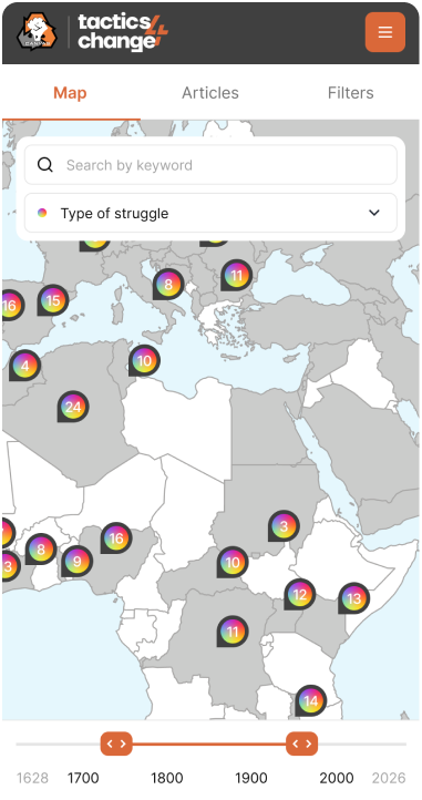
The core screen structure required little debate: a full-width map canvas with a persistent sidebar on the right for filters. This pattern gave us maximum map real estate while keeping controls always visible — no hidden menus, no extra taps to access filters.
The interesting design work happened inside the map itself.
The pin system — four states to solve
The central wireframing challenge was defining how pins behave across different contexts. We identified four distinct states that each needed their own design solution:
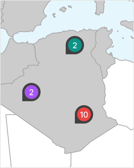
Zoomed in — individual pins
Colored by category, with one pin per category; the number indicates the total events.
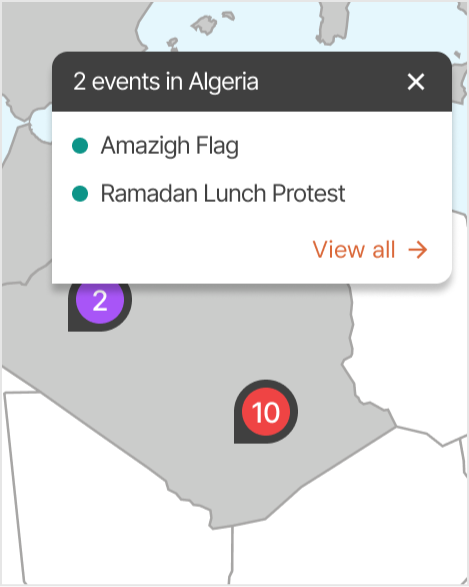
Pop-up on pin click
Tapping a single pin opens a compact tooltip with 3 articles and a link to the cases page.
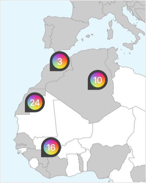
Zoomed out — category cluster
When different categories overlap, the cluster uses a neutral style — signaling "multiple types here".
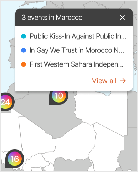
Pop-up on cluster click
Shows a small list or summary of the cases inside, with the option to zoom in or browse directly.
Visual design
No brand guidelines — full ownership
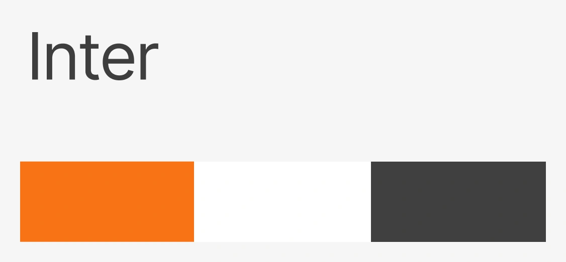
We had no existing brand guidelines, which gave us full creative ownership. We chose orange as the primary accent color early — before we'd even looked closely at the CANVAS website. When we later found they'd independently landed on orange too, it felt like a good sign.
The 9 protest categories each received a distinct color. These weren't decorative — they were the primary navigation logic on the map. Learn the system once, read the entire map at a glance.
Our visual philosophy was restraint. The subject matter is inherently complex — hundreds of historical events, layered data, geopolitical context. The content does the heavy lifting. We kept the UI clean and understated: simple typography, clear hierarchy, no visual noise. The map and the content are the heroes. The interface is just the frame.
Development & launch
We knew our development resources were finite from the start, so design decisions were made with buildability in mind throughout — not as a constraint discovered at the end. By the time we reached handoff, there were no surprises: most technical considerations had already been absorbed into the design during the process.
The product shipped to production and remains live. CANVAS continues to actively add new cases to the database — a meaningful signal that the system works well enough that they trust it and keep investing in it.
Reflection
The UX decisions hold up. The filter prioritization, the pin system, the IA — these still feel like the right calls.
What I'd do differently is stay more involved past handoff. There's a gap between a polished Figma file and a polished shipped product, and closing that gap requires a designer to be present and vocal during implementation. I underestimated how much that final mile matters. It's a lesson I carry into every project now: advocacy for the design doesn't end at handoff.
Note: the live product may differ visually from the designs presented in this case study, as some UI details were adjusted during development.
Telegram
@lizzie_shs