ConnectUS: invite-only alumni platform from brand identity to shipped MVP.
Client: ConnectUS is a nine-month initiative led by Fulbright & Friends Serbia, supported by the Macedonian American Alumni Association and funded by the U.S. Department of State. At its core is a secure, invite-only alumni directory — a private space where verified alumni of U.S. exchange programs can find each other, collaborate across fields, and stay engaged with the community.
I joined the project as the sole designer — responsible for the complete experience from visual identity to shipped product.
Role:
Solo UX/UI Designer
Type:
Brand Identity + Product Design
Collaboration:
PM, development team, stakeholder
Context & problem
Alumni of U.S. exchange programs in Serbia had no dedicated space to find each other after their programs ended. Existing tools — LinkedIn groups, email lists, informal WhatsApp chats — didn't support structured discovery by program, year, industry, or expertise. The network existed in people's heads, not in any shared system.
The project also had a hard constraint that shaped the entire design: this was not a public platform. Only verified alumni could join, and only via a personal invitation. This requirement wasn't a limitation to work around — it was the product's core value proposition. Trust and exclusivity were features.
One-month deadline, two distinct user types, and a product that needed to go from zero — no brand, no mockups, no design system — to a fully shipped MVP.
Define / Synthesis
Understanding the users:
The platform serves two very different types of users, each with distinct goals and mental models.

Alumni
Professionals aged 20–45, comfortable with standard web apps, but not necessarily with complex tools. They want to find people and be found — quickly and without friction.
Admin
An internal team member managing the community. They need full control over member data, invitations, and change requests — with clarity about what's pending and what needs attention.
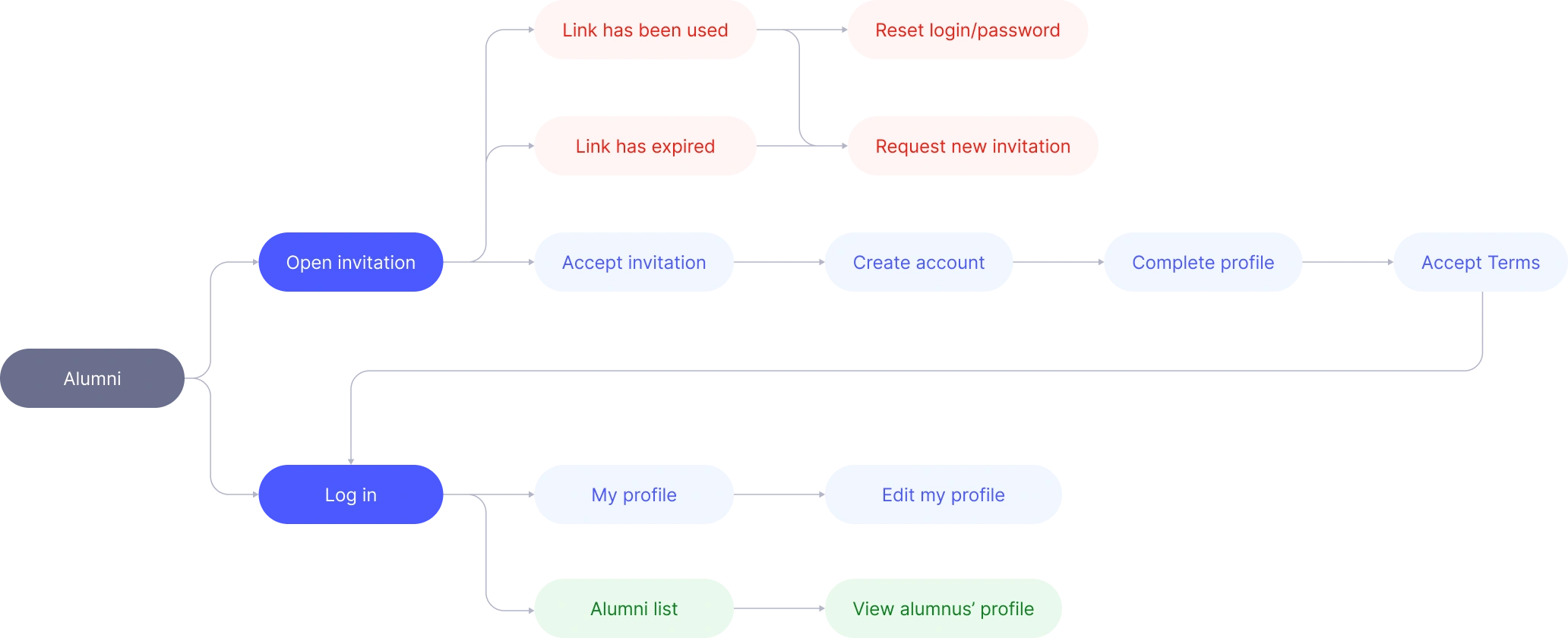
Alumni flow
The alumni journey has a defined entry point — an invitation — and expands from there. The core challenge was onboarding: profiles need to be complete for the directory to be useful, but long forms cause drop-off. The solution was a multi-step registration that breaks the process into logical chunks, covered in detail in the next section.
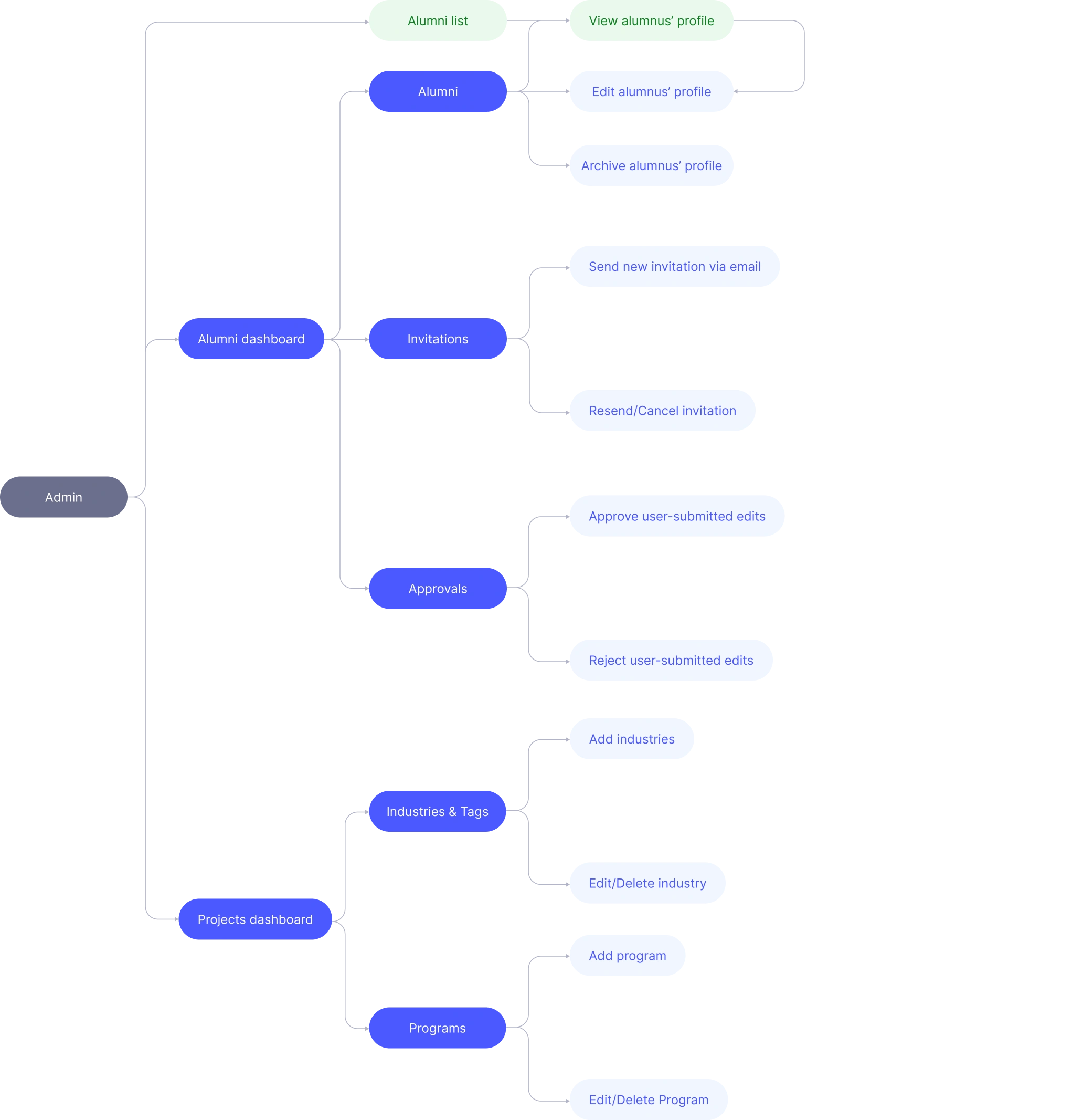
Admin flow
The admin panel needed to give coordinators full visibility and control without becoming a complex back-office tool. I scoped it tightly to the MVP: member management, invitation management, change request review, and content additions.
Key design decisions
Multi-step registration
Alumni profiles require a lot of data — program info, professional background, skills, contact details. Breaking it into named steps with a progress indicator makes the process feel manageable and reduces drop-off.
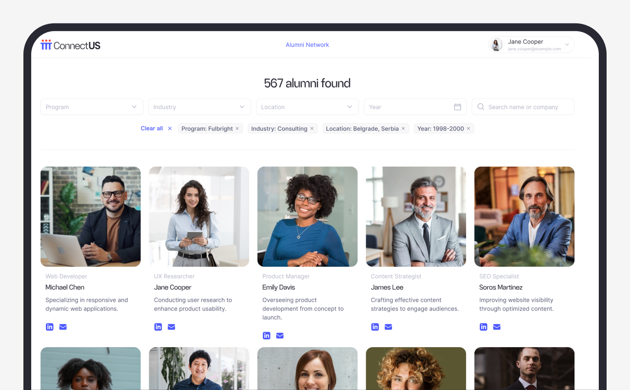
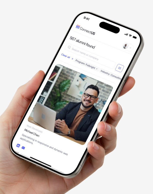
Alumni directory with filters
The core value of the platform is discoverability. Members can search by program, year, industry, or expertise — making it easy to find the right person without scrolling through the entire list.
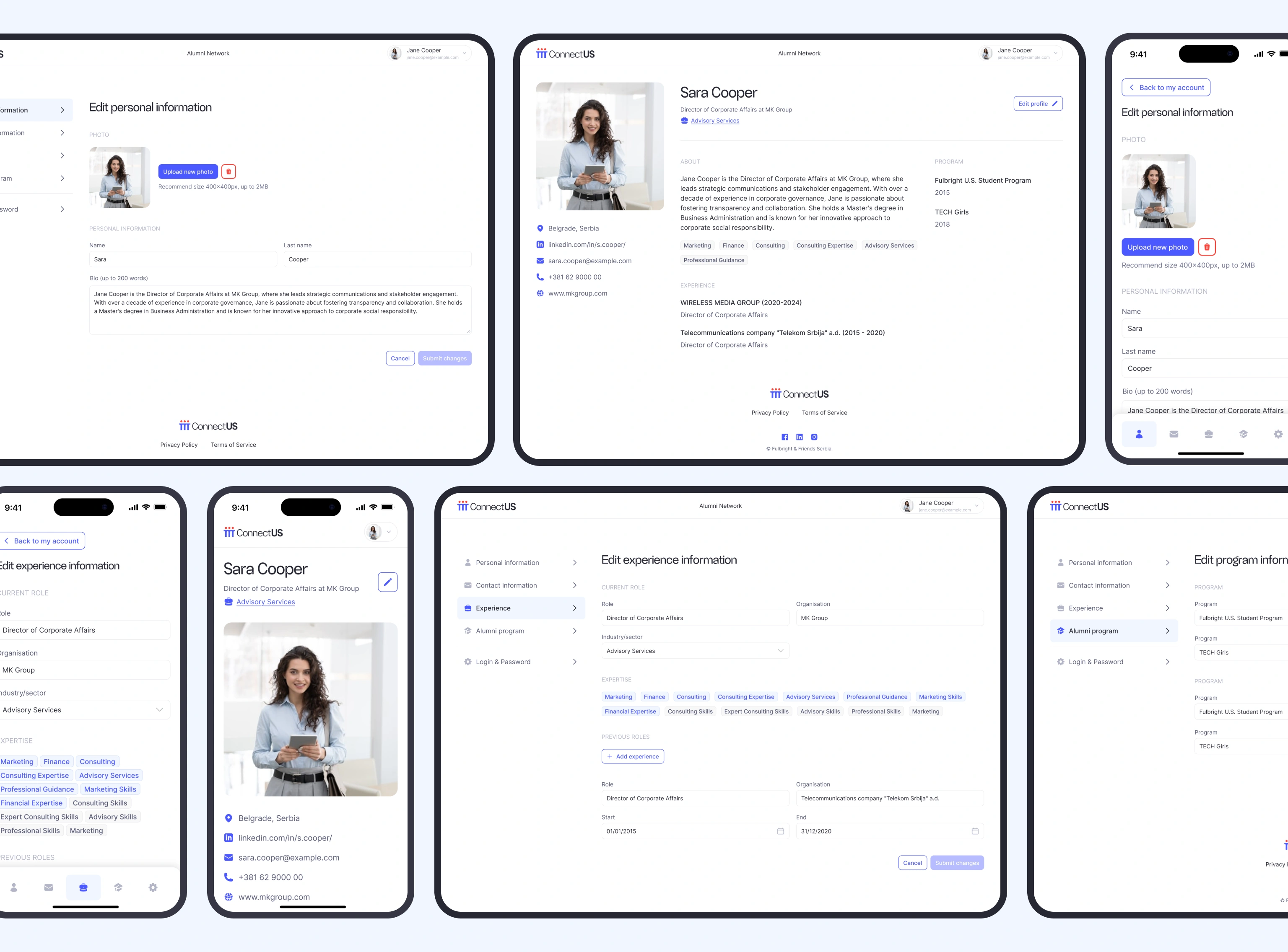
Member profile & edit request flow
Alumni can view their profile and submit changes — but edits go through admin approval, not direct updates. This keeps data quality high and maintains the organization's control over what's in the directory.
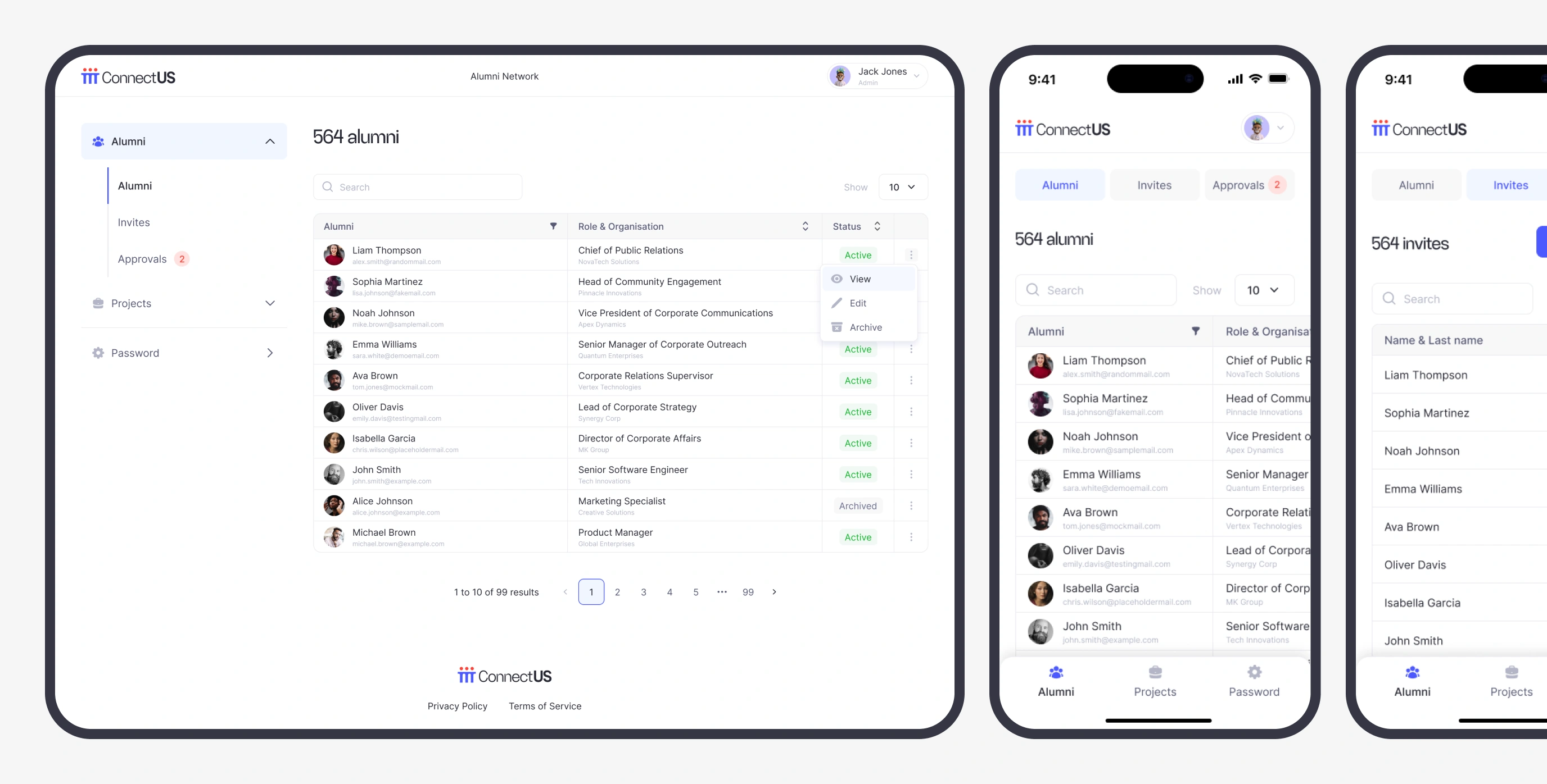
Admin panel scoped to MVP needs
Rather than a complex back-office tool, the admin panel focuses on daily coordinator actions: managing members, reviewing change requests, sending invitations, and adding projects. Nothing extra.
Edge cases
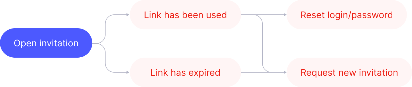
Because access is invite-only, the invitation link is the single entry point to the platform. That makes it critical to handle edge cases — if the link fails and there's no recovery path, the user is simply locked out. I designed both failure states as first-class flows, not error pages.
Both paths are short, clear, and always give the user a next action. The goal was to keep the onboarding funnel intact — no frustrated drop-off at the very first screen.
Outcome
The platform launched on time, covering the full scope — brand identity, landing page, and internal platform for both user roles. It went from a blank Figma file to a shipped, live product in one month.
For me, shipping this meant proving that a solo designer can own an entire product end-to-end — from the first logo sketch to a live system used by real people — without cutting corners on either craft or logic.
Telegram
@lizzie_shs