Redesigning the e-commerce experience for Serbia's largest LEGO® distributor
The client is Serbia's largest LEGO distributor, running a well-established B2C e-commerce platform with a loyal customer base. Despite strong brand recognition and market presence, the business was experiencing silent drop-offs — customers were leaving at certain points in the journey without completing purchases.
The challenge wasn't to rebuild what was working. It was to identify where and why users were losing interest, and to redesign those moments without disrupting what already resonated with the audience.
Role:
Solo UX/UI Designer
Type:
B2C E-Commerce Redesign
Collaboration:
PM, development team, stakeholder
What I did
Conducted UX and market research to identify friction points in the existing experience
Defined information architecture and optimized user flows
Designed and nurtured design system
Designed wireframes, prototypes, and final UI
Collaborated with PMs and development team
Facilitated feedback sessions with stakeholders and iterated based on findings
Problem statements
Despite being a market leader, the platform was losing potential customers silently. No dramatic errors — just friction. Users were getting lost before they even reached a product page.
The core issue was navigational chaos: too much information presented without clear hierarchy, no visual cues to guide users through the catalog, and a product card structure that didn't prioritize what mattered most to buyers.
How might we restructure the information architecture and visual hierarchy so that users can find what they're looking for — and feel confident enough to buy?
Research
By employing heuristic audit of the current platform and conducting competitor analysis (both regional and international in the LEGO/toy e-commerce), I identified the key findings:
From the audit:
Navigation felt overwhelming — categories lacked clear hierarchy and visual separation
No guiding elements to lead users through the browsing journey
Product cards were dense and unstructured, making it hard to scan key information quickly
From competitors analysis:
Competitors presented catalog navigation with a clear, scannable structure
Category groupings followed mental models users already had
Product cards used consistent visual rhythm: image → name → price → CTA
The problems weren't unique to this audience — they were classic information architecture failures.
Define / Synthesis
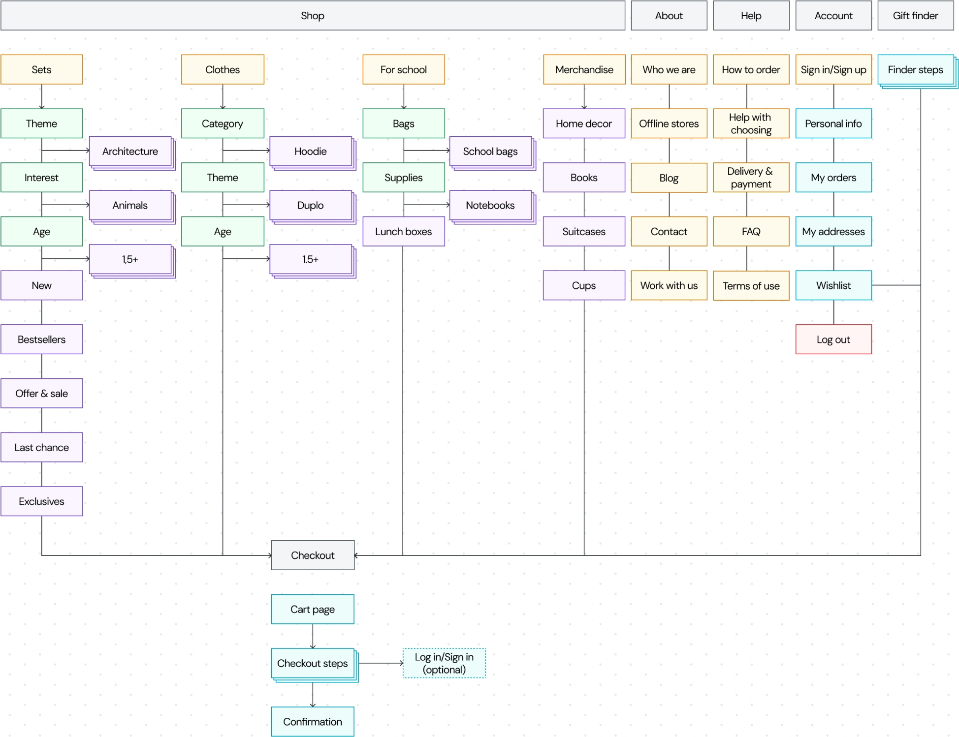
Before jumping into solutions, I mapped the full site structure to understand what existed and how it related. The sitemap revealed the core issue immediately: the category system had grown organically without a clear taxonomy, causing overlaps and dead ends.
Key opportunity areas identified:
Consolidate bloated navigation into a manageable top-level structure
Introduce hierarchy through a mega menu rather than flat category lists
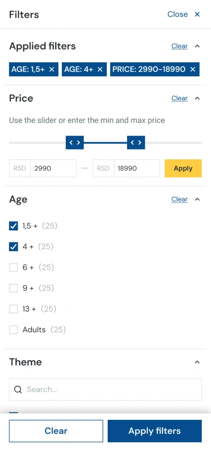
Restructure product cards to separate signal from noise
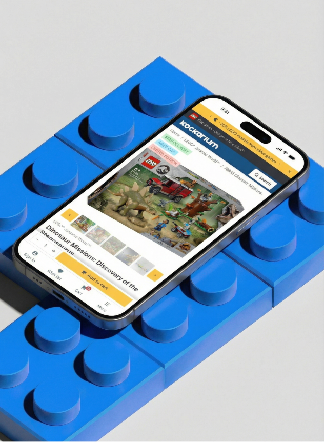
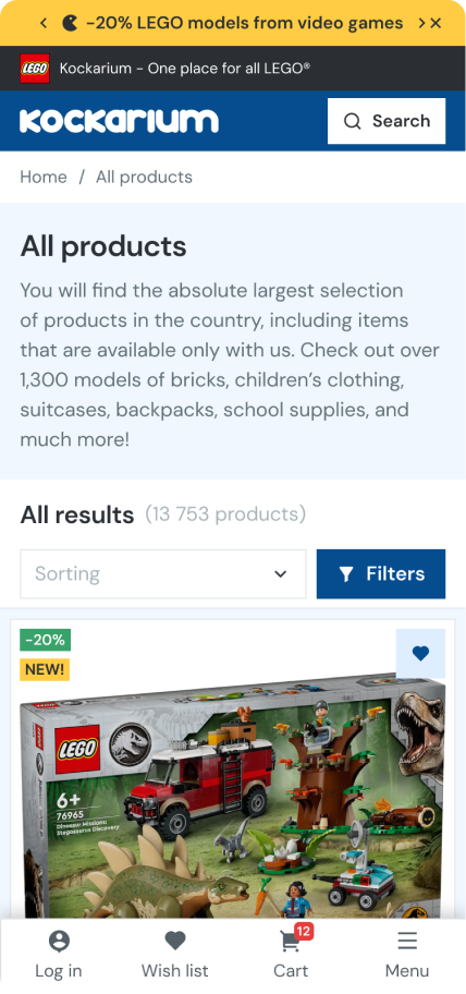
Prioritize mobile experience — analytics showed nearly 70% of purchases happened on mobile
Ideation
& Design decisions
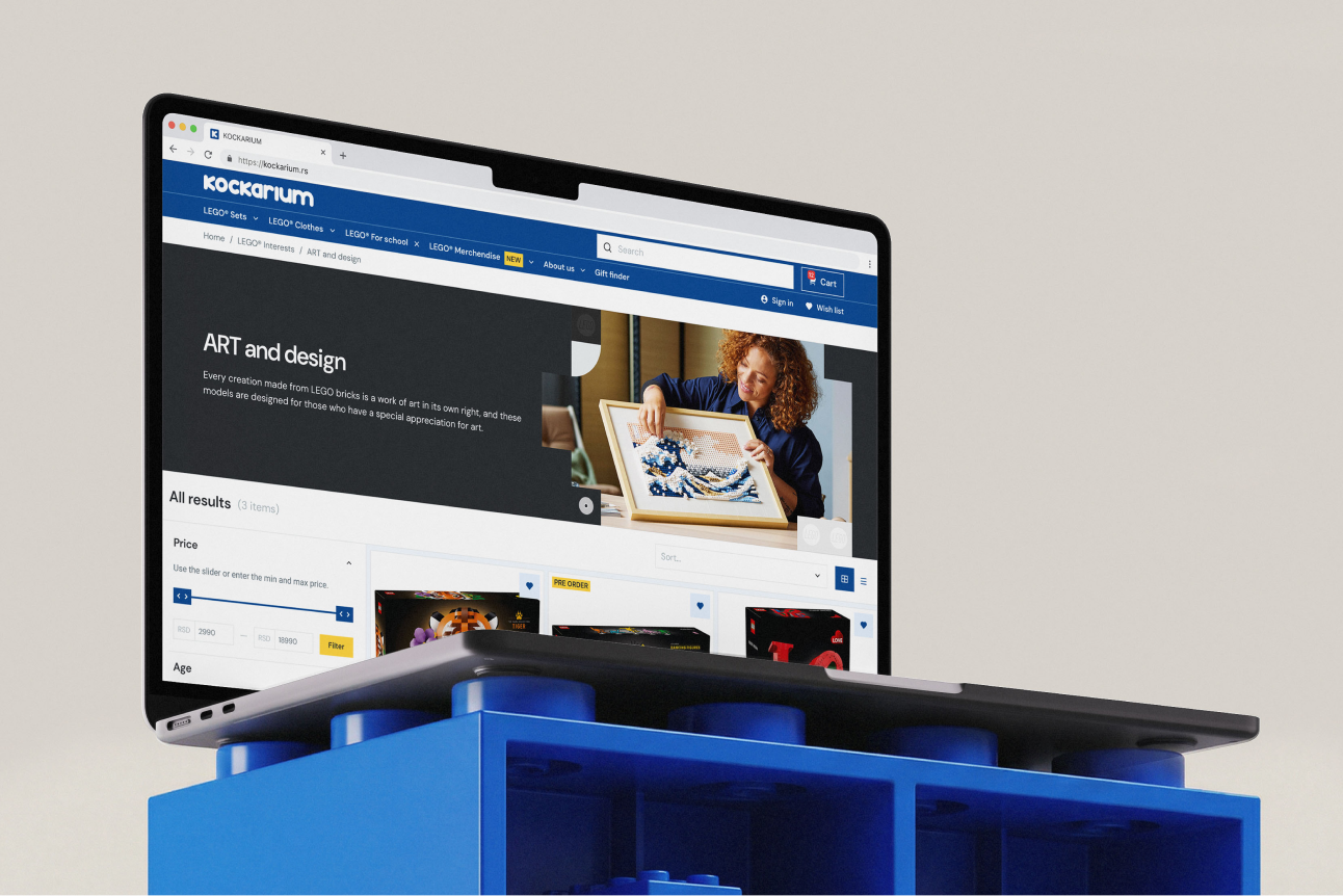
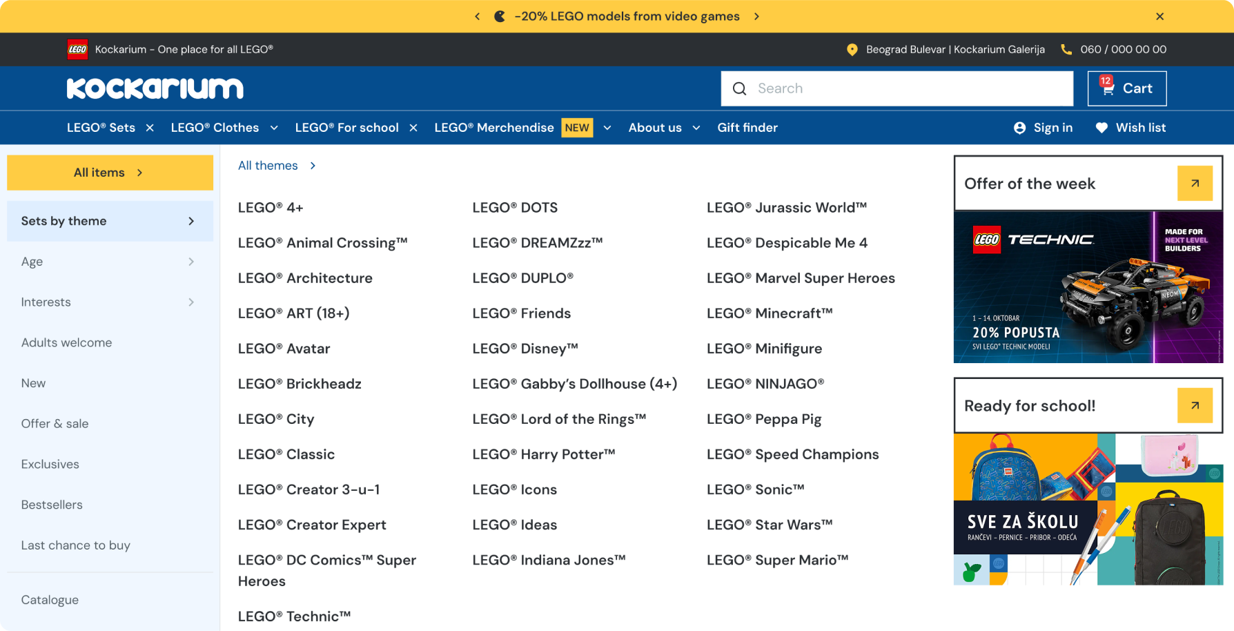
Navigation redesign
I reduced the top-level categories from many overlapping options down to four clear pillars: LEGO® Sets, LEGO® Clothing, LEGO® for School, and LEGO® Merch. Each expands into a mega menu with meaningful subcategories — for Sets: by theme, by age, by interest, for adults, new arrivals, exclusives. This gave users a mental model they could hold, and eliminated the cross-category confusion.
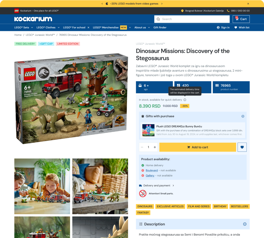
Product card redesign
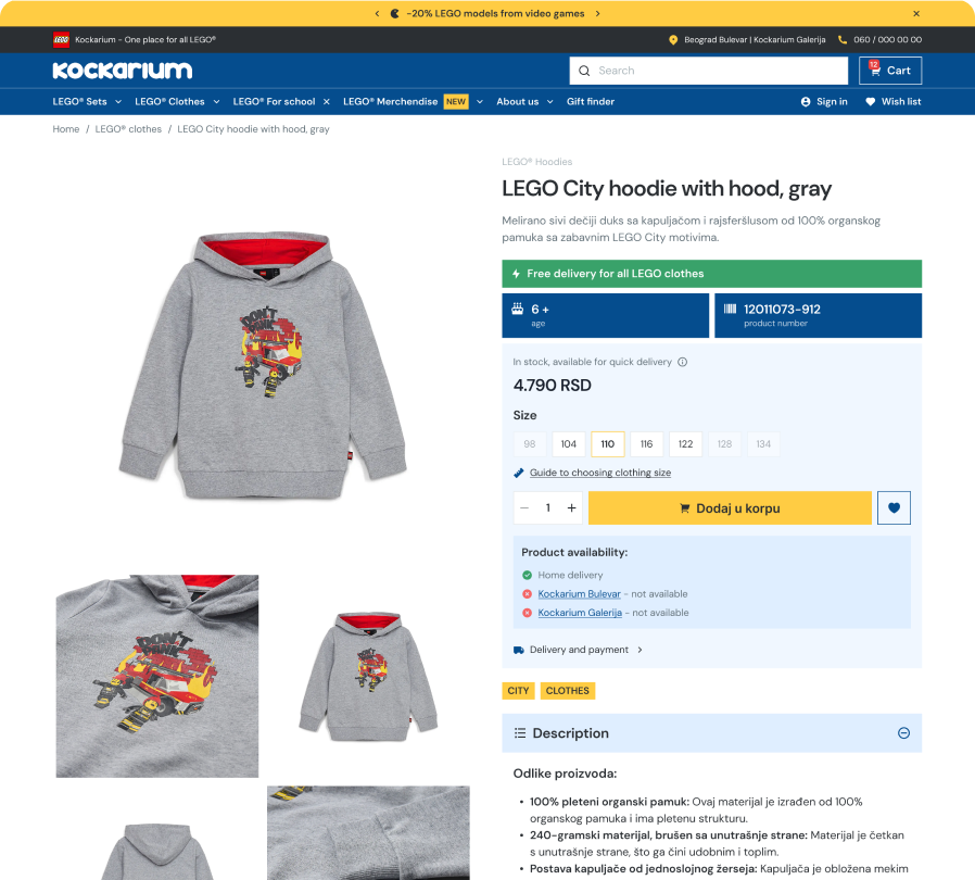
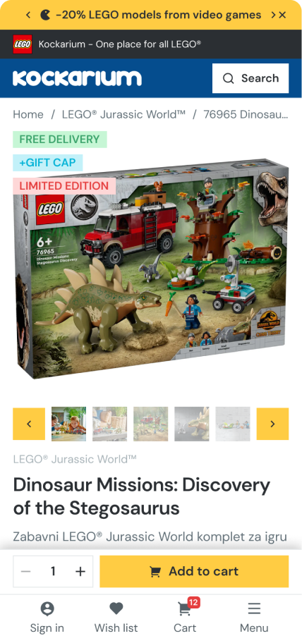
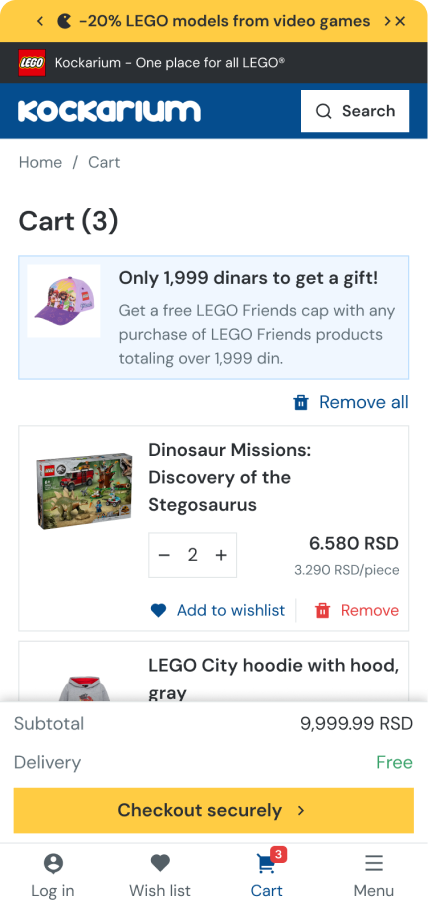
All existing information was reorganized into thematic blocks with clear visual separation. I designed two card variants — one for sets and general products, one for clothing (adding size selection and a size guide). The redesign wasn't about removing information, but giving each piece of it a proper place and weight.
Mobile-first decisions
Given the 70% mobile purchase share, mobile wasn't an afterthought. I introduced a sticky bottom navigation bar sitewide, and within the product card specifically, the “Add to cart” button was anchored to the sticky bar — always visible, never requiring a scroll.
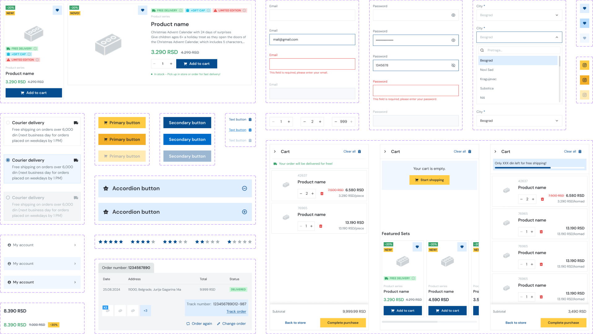
Design System
The redesign required building a design system from scratch. It was based on a Tailwind CSS foundation, adapted to the client's brand identity — color palette, typography, spacing tokens, and component library.
Key components built out: navigation (desktop mega menu + mobile), product cards (two variants), size guide modal, sticky mobile CTA bar, and core layout grid.
The visual direction kept the energy of the LEGO brand — bold, clear, playful where appropriate — while bringing the structure and breathing room the original site lacked.
Prototyping & Testing
Formal usability testing with external users wasn't part of the project scope. Instead, validation happened through internal review cycles — the design team, PM, and client stakeholders all acted as proxy users throughout the process.
This approach had a clear advantage: the client knew their customers well, and their feedback was grounded in real business experience. Design decisions were stress-tested through structured review sessions, where each iteration was walked through screen by screen with rationale.
While this isn't a substitute for user testing, the iterative review process ensured no major assumptions went unchallenged.
Key feedback loops:
Stakeholder walkthroughs after each major milestone (IA, wireframes, final UI)
Developer reviews to validate feasibility within the Tailwind-based system
Client sign-off on navigation structure before moving to visual design
Results & Impact
The redesign shipped as a full platform overhaul. Without direct access to post-launch analytics, the outcomes are framed around the design decisions that addressed the original pain points:
Navigation clarity — reducing to 4 top-level categories with a structured mega menu eliminated the cross-category overlap that was the primary source of user confusion
Product discovery — users now have multiple entry points into the catalog (by theme, age, interest) matching different shopping intents
Mobile conversion readiness — the persistent "Add to Cart" CTA on mobile removed a known friction point for the 70% of users shopping on phone
Scalability — the Tailwind-based design system gives the development team a consistent component library to build on as the catalog grows
The client accepted the redesign in full, with no major structural changes requested after the final presentation.
What went well
Working as the sole designer gave me end-to-end ownership — from sitemap to shipped UI. The collaboration with the PM and developers was tight, which meant design decisions were grounded in both user needs and technical reality from the start.
What I'd do differently
I would push harder for at least one round of lightweight usability testing — even five users navigating the catalog would have added confidence to the navigation decisions. The internal review process worked, but real user behavior always surfaces surprises that stakeholders can't anticipate.
What I learned
Information architecture is often invisible when done right — users just find what they need. This project was a good reminder that the most impactful design work isn't always the most visually dramatic. Restructuring a category system and cleaning up a product card created more meaningful change than any visual refresh could have on its own.
Telegram
@lizzie_shs