Lowie: an AI food scanner for the low-FODMAP diet, from research to a launch-ready build.
Product: A Telegram Mini App that tells people on a low-FODMAP diet whether a meal is safe from a single photo, explains every ingredient, and logs the meal for them. Low-FODMAP is a diet used to manage IBS. Following it means checking every ingredient of every meal, often while anxious about the next day.
I did the research, designed the product and built it, with Claude Code as my pair for the code.
Role:
Solo product designer and researcher
Platform:
Telegram Mini App, PWA as a backup
Status:
Working build on a test bot, pre-launch
For someone on the diet, every meal is a small research project.
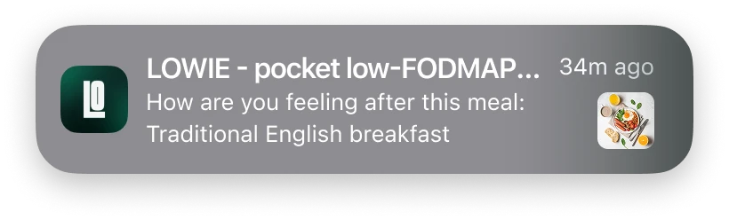
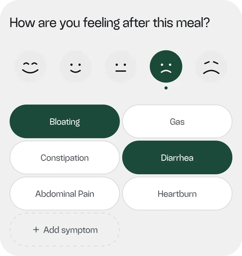

For someone on the diet, every meal is a small research project.
The problem
People newly diagnosed with IBS have to decide what is safe in seconds, but current tools are barcode-only, hard to trust, and make logging a chore. So they Google every ingredient and stop tracking symptoms.
Competitors I reviewed: Monash, Fig, Spoonful, Cara Care, FoodMarble, Zemedy. None of them scans a fresh or restaurant meal.
Who it is for
Three people, three stages of the diet:
Personas, empathy and journey maps came first, then a 10-person survey to test the assumptions behind them.
Primary · Elimination
Sofia
Newly diagnosed and anxious. Needs fast answers she can trust.

Experienced · Reintroduction
Marcus
Knows the rules. Wants evidence of what he ate for his dietitian.
Experienced · Caregiver
Elena
Cooks for someone else. Needs a clear yes or no.
8/10
check food by Googling the ingredient
7/10
trust an AI answer only if it explains why
6/10
who tried logging stopped because they forgot
Survey of 10 respondents recruited from Facebook groups and Reddit (June 2026). A small sample, used to test assumptions, not to size a market.
Decision 1 · Channel
Build in Telegram, even though 9 of 10 respondents don't use it
The survey was the biggest warning of the project, but its sample came from Facebook and Reddit, which skews against Telegram. I found real FODMAP communities there. A Mini App needs no install and no store review, so I could ship a first version fast. I accepted the risk and kept a PWA as the fallback.
Decision 2 · Onboarding
Let people scan first and teach them inside the app
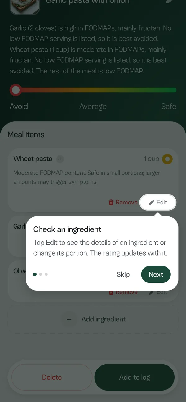
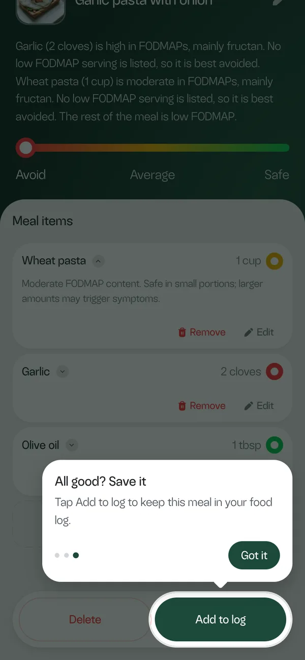
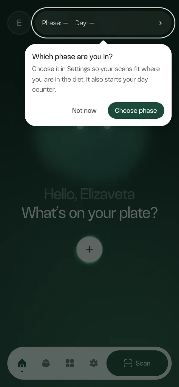
I planned a short onboarding, then dropped it. Someone standing at a shelf wants to open the app and scan, and a questionnaire first feels like a wall. So first launch is only a welcome screen and one consent screen, and the app teaches itself later, one hint at a time, at the moment each hint becomes useful.
On the first result, three hints dim the screen and light up one element each: check an ingredient, add what the photo missed, save the meal to the log.
After the first meal, a hint on Home asks which phase of the diet the person is in. It waits until there is a meal, so the question has a reason, and it can be put off with "Not now".
The rule I followed: ask for information when it matters to the user, not when it is useful to me.
Decision 3 · Personalisation
Different rules for different stages of the diet
"Elimination" and "reintroduction" are clinical words, so the app explains each phase in one plain sentence and says what changes for the person:
Phase
Who
What the app does
Elimination
Sofia, strict and anxious
Strict scans. Anything risky is marked "avoid", with no "fine in small amounts" hints that invite guessing.
Reintroduction
Marcus, testing triggers
Portion sizes for risky foods, so he can test small amounts and log symptoms.
I don't know
Just starting
Strict rules until a phase is picked.
My research suggested a neutral mode for the unsure. I chose a strict default: for an anxious beginner, a wrong "fine" costs more than a cautious "skip it".
My research suggested a neutral mode for the unsure. I chose a strict default: for an anxious beginner, a wrong "fine" costs more than a cautious "skip it".
Decision 4 · Trust
Earn trust instead of sounding confident
An AI that is wrong and sure of itself is worse than a slow answer. Photo scanning cannot see inside a dish, so the design assumes the AI will sometimes miss something.

Explain every rating in plain language. 7 of 10 said this decides whether they trust it.
Let the person correct it. Ingredients are editable, the rating recalculates, and nothing is saved until "Add to log".
Claim only what I can back up. Survey respondents wanted a Monash citation. I could not confirm the licence of the product catalogue, so the app says "published low-FODMAP research and open data" instead.
An AI that is wrong and sure of itself is worse than a slow answer. So every ingredient can be checked and corrected.
An AI that is wrong and sure of itself is worse than a slow answer. So every ingredient can be checked and corrected.
The product
Scan, understand, log, reflect
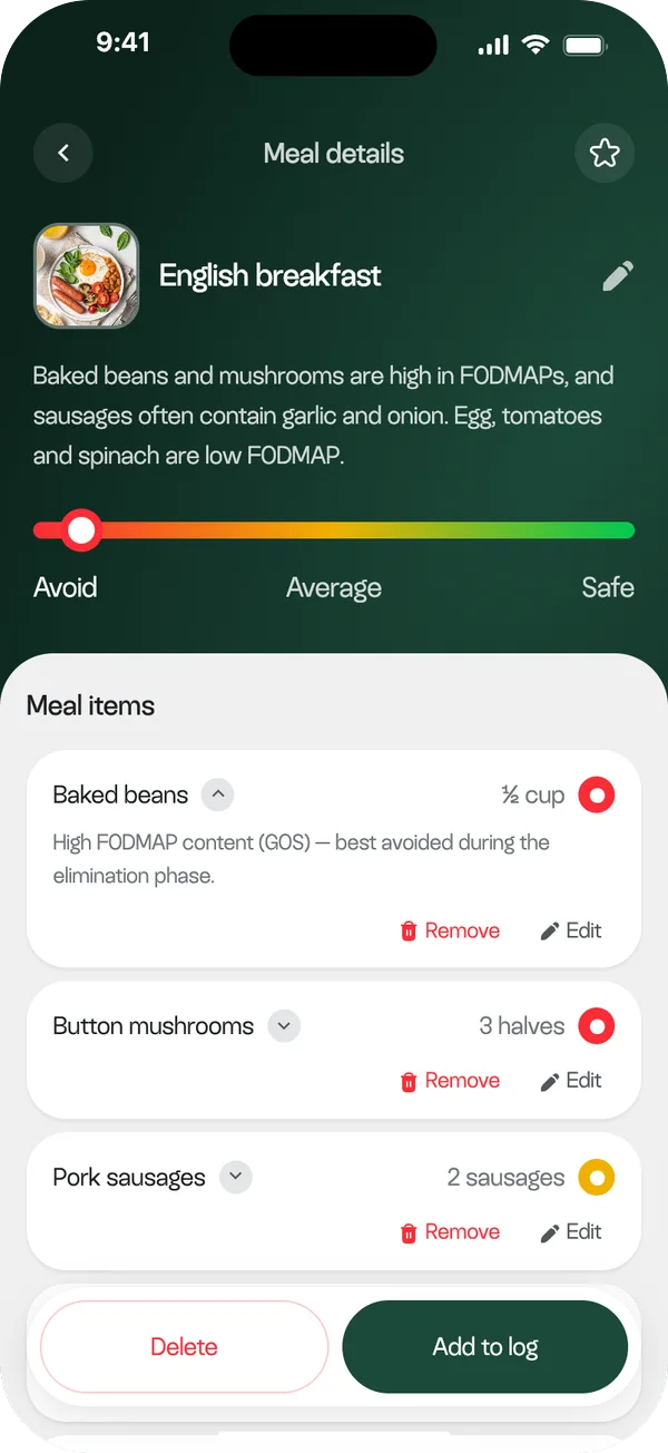
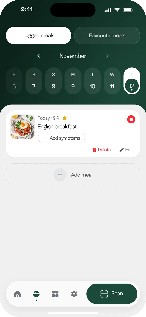
The whole app is built around one loop. The person takes a single photo of the plate, and the app recognises the ingredients and rates the meal as a whole and each ingredient on its own, with a plain-language reason for every rating.
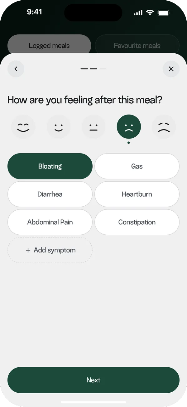
One tap on "Add to log" saves the meal to that day. A few hours later the app asks how it went, so over time the food log turns into a record of what was eaten and how it felt, which is what people bring to their dietitian.
Reminders the person controls
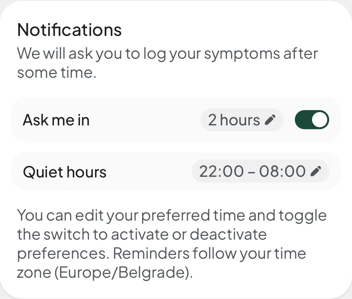
The survey said people forget to log, so the app asks them. After a meal is saved, a Telegram message asks how it went and opens the symptom log. Symptoms show up hours later, so the person sets how long after the meal the reminder arrives.
Their timing. "Ask me in N hours" is a setting, not a fixed rule.
Quiet hours. A reminder that would land at night waits until morning.
Named meal. The message says which meal it is about.
Structure
The plan started with five equal tabs. In the app the bottom bar has four small icons and one wide Scan button, because scanning is the job and everything else supports it.
Home
Phase and day card
Greeting and scan button
Scan
the jobCamera, gallery or favourites
Result
Edit or add ingredient
Add to log
Food log
Logged and favourite meals
Calendar
Meals per day
Symptoms after a meal
Directory
Search and filters
Item with portions
Settings
Reminders and quiet hours
My phase
Privacy, export, delete
Under the hood
The design system lives in code as tokens (16px page gutter, 56px buttons, 24px card radius, static sheets with animated inner elements), so every screen follows the same rules. React and Vite on the front end, Hono, Postgres and grammY on the back end, GPT-4o with structured output for the scan, and 100 automated backend tests.
Status & next steps
The app runs on a test bot inside Telegram. I have no usage metrics and no tester feedback to quote yet. What I have is a survey that confirmed the logging, trust and portion-size assumptions and challenged the channel one, plus people who signed up to test it.
Next: run the moderated usability test (the plan is written), have a lawyer review the consent, privacy and terms drafts, and launch.
What I would do differently
Talk to people before polishing. My "interviews" were a survey. Five conversations would have taught me more about hidden-ingredient anxiety than any chart.
Design for the AI being wrong. The hardest trade-off was speed against a false "safe". Editable ingredients and strict defaults came from taking it seriously.
Designing with an AI pair changed my habits. I work tokens first, keep alternatives on branches, and check every change on a phone in Telegram instead of trusting the browser.
Telegram
@lizzie_shs